Friday, December 2, 2011

Review Week 16

How many points are in an inch? 72 How many points are in a pica? 12
Of the seven classifications, which classification(s) would best work as body type? Why?
the first, fourth, fifth, and the last one because they are the most readable.
Identify the lowercase characters that have ascenders?
b,d,f,h,k,l,t
Identify the lowercase characters that have descenders?
p,g,j,q,y
Classify the following typefaces and briefly explain why you believe it should be classified that way:

old style

script
Decorative
sans serif 


Decorative

Old style
Old style 


Tuesday, November 29, 2011

Podcast #4 Typography

Define typography?
The art of expressing ideas through the selection of appropriate typefaces. 
creating and modifying type using a variety of illustration techniques.
Where did the word "typography" originate from?
greek, form and writing
What does typography involve? creating and modifying type using a variety of illustration techniques.
What is a typeface? distinctinve desighns of visual symbols that are used to compose a printed image/design.
What is another term for typeface? fonts
What is a character?
individual symbols that make up a typeface. letters, numerals and punctuation marks.
What is type style?
modification in a typeface that create design variety while maintaining the visual style of the typeface.
What does type style "create" within a design?variety and interest,  bold, italic, condensed, roman, heavy.
What is the waist line and what does it indicate?

imaginary line drawn at the middle of the characters.
What is a base line and what does it indicate?
imaginary line drawn at the bottom of the charachters.
What is an ascender?
the part of the character that extends above the waist line.
What is a descender?
the part of the charachter that extends below the base line.
Describe a serif?
smaller line used to finish off a main stroke of a letter, usually at the top and bottom of a character.
How can the size of the typeface be identified?
the vertical measurement used to identify the size of a typeface. measures from the top of the ascender to the bottom of the desender is point size.
What is a point?sub devision of a pica
How many points are in an inch?
72 smallest unit of measure
What is a pica and how many are in an inch?
another unit of measure, 6 pica in an inch
How many points are in a pica?
12 points
What is body type and where can it be found?
types size that range from 12 point type, 
type sizes that rang from 4pt through 12pt type. these sizes are found in place where there is a lot of text to be read.What is the key to selecting appropriate typefaces to be used as body type?
readably
What is display type and how is it used?
anything above 14 point type.
What is reverse type and when would it be used? consistes of white type on a solid black or darker color background, if the text is too small reverse type can be difficult on the readers eyes.
What is a typeface classification?
a basic system for classifying typefaces was devised in the 19th century when printers sought to identify a heritage for their own craft.
When was Blackletter invented and how was it used?
is the earliest of the typefaces. it was used with the inventions of the printing press in the mid 1400s.
Describer the characteristics of a Blackletter typeface?
thick and then strokes
When was Old Style invented and what was is based on?
old style or roman, it was based on ancient Roman inscriptions and created to replace Blackletter typfaces.
Describe the characteristics of an Old Style typeface?
they have serifs, they have thick and thin with those serifs
When were formal scripts developed?
from formal writings of 17th and 18th century handwriting masters. they will lend a formal quality to a composition. actual handwriting
When were casual scripts developed? in the 20th century
Describe the characteristics of a Script typeface?
based on forms made with flexible brushes or pens and have varied strokes reminiscent of handwriting
When was Modern typefaces developed and why?in the late 18th and 19th centuries as a radical break from traditional typography of the time.
Describe the characteristics of a Modern typeface?
have a sharp contrast between thick and thin strokes and have thin, flat serifs
How early can Sans Serif typefaces be found? What happened? as early as the 15th century, the italian Renaissance return to Old Style made the Sans Serif classification obsolete in the soth century.
When did they become popular? in the 1920
What does "sans serif" mean? without serifs
Describe the characteristics of a Sans Serif typeface?
its strokes are uniformed in weight and have a monotone appearance.
When was Slab Serif developed and why? developed in the 19th century for advertising purposes, its mainly used for decorative purposes and headlines.
Describe the characteristics of a Slab Serif typeface?
has a uniform line weight and thicker, square serifs.
Describe Decorative typefaces? these typefaces have the most distinctive design style. picture fonts.
Why were they developed?
decoration to fit in specific themes.
What are they best used for?they are best used for larger point sizes, or display type.

Friday, November 18, 2011

Review Week 14

Identify 5 colleges that offer graphic design (or related) majors. For each, list the school name, location, graphics majors that are offered, requirements for admission. 1.Academy of the art state:CA requirements: Statement of Intent One page, typed, explaining your goals in Graduate School Résumé Describe your educational and professional experience. official college transcript Transcripts must show completion of an undergraduate degree. You must submit official transcripts from the institution from which you graduated. graphic major offered: Associate of Arts,Bachelor of Fine Arts,Master of Fine Arts and Online Award of Completion.

2.Savannah college of Art design state:GA requirements:A diploma from a United States high school or
equivalent program.Official report of SAT or ACT scores for citizens and permanent residents of the United State Additionally, if applicable, any other documents or materials required to obtain a studentvisa.Supplementary materials graphic major offered: Certificate in Digital Publishing Graduate Certificate in Digital Publishing Management Graduate Certificate in Typeface Design
3.Armillo college state:TX requirements:
4.Andrews university state:MI requirements: Each applicant must complete a Graduate Application GPA of at least 3.0 majors that are offered Art Direction/Advertising, Fine Art, Graphic Design, Multimedia Arts
5.Full Sail University state:FL requirements: standard High School diploma or GED Two letters of recommendation GPA of 2.5 graphics majors that are offered digital video, andthe fundamentals of web design and Flash media.
Answer the following questions in your own words...What is a portfolio? an edited collection of artwork intended to showcase an artist's style or method of work
What is the importance of a portfolio?show cases the work that they have done,it is easier for people to be able to see what have done in the same place

Review Week 13

For each of the 8 principles of design, find an example that utilizes the principle within the design. You should have 8 DIFFERENT sample designs. For each, discuss how the particular principle is used.

Harmony 
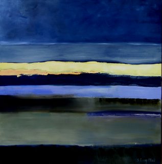
In the painting, Sun's Trail by Dosia McKay, all the colors work together to make a certain mood. Plus, the lines all point in generally the same direction, making the piece less confusing.


Rhythm
Rhythm is created when elements are repeated. In Arcadian Rhythm by Thomas Sorrell, the rocks and the trees are repeated.


proportion
the two trees at the left seem bigger compared to the right. If the trees on the left were to be moved at the same level as the ones at the right, they'd be the same size.


Emphasis 
Making an element of the piece more important. In the picture, the soldier is emphasised because his red shirt stands out from the grey background.Also, answer the following questions in your own words.


Variety
This painting is an example of variety because of all that is going on in the picture.  The different colors create a frenzied image.  Variety can be the opposite of unity, and this picture displays that.


Balance 
The balance of a picture is similar to a see-saw. In the example, the bottom half (the large pancakes) is balanced by the upper half's three items.


unity
All of the members are wearing uniform, and are drawn in the same style of the members are wearing uniform, and are drawn in the same style.


Contrast
This picture displays contrast because of the way the dark colors make the off white stripe stand out.  The colors separate from each other which creates emphasis on the white strip.


How do you add a layer mask to a particular layer?
the button with the gray background and the white circle.
What two colors are used to create the mask?
black and white
Describe the process of using a layer mask?

the black hides the images and the wight shows it.

Review Week 12

How can you, as the designer, use principles of design to help compose a page?

What are the principles of design (define each in your own words)?


Designers use principles of design to create the most attractive layouts they can in their works.

The principles of design are balance, gradation, repetition, contrast, harmony, dominance, and unity.
Balance has positive space on either sides of the piece.  Repetition has the same idea throughout, but may vary.  Contrast has opposing colors or ideas.  Harmony has similar, related elements.  Dominance has one element that stands out to create interest.  Unity refers to the visual linking of various elements of the work.

Stephen Kroninger

(www.stephenkroninger.com)


What kind of art/design does he produce?
He takes images and makes either realistic or surreal collages.


In what publications/media studios has his work been featured?
His pieces have been published in Rolling Stone, New York Times, and he has published a few Children's books such as If I Crossed the Road and Tie Your Socks and Clap Your Feet.


Michael Jackson was published in the New York Times.  He uses dominance to make the eyes stand out, balance to move the lips down and have positive space throughout the face, and repetition with the eyebrows.


Street Sweeper was published in The New Yorker.  Contrast is used in the blue shirt and the broom and balance lets the broom go across the page.

Wednesday, November 2, 2011

Podcast #3 Principles of Design

Define principles of design? are concepts used to arrange the structural elements of a composition.
What do the principles of design affect? affects the expressive content, or the message, of the work.
What is the principle of repetition? is repeating some aspect or element of the desighn throughout the entire document.
Describe ways that the principle of repetition helps the composition/audience? works with patterns to make a composition seem active. repeating desighn elements helps the viewer navigate through the piece
What are ways that you can incorporate repetition into your designs? bold font, thick line, certain bullet, color, design elements, particular format, and spatial relationship
What should you avoid when working with repetition? it is important not to repeat so much that it becomes annoying or overwhelming.
What is the principle of proportion/scale? refer to the relative size and scale of the various elements in a design
What is the most universal standard of measure when judging size? is the human body
How can the principle of proportion/scale be used as an attention getter? unusual or unexpected scale can be used as an attention getter.
What is the principle of balance? distribution of heavey and light elements on the page.
Which kinds of elements/shapes visually weigh heavier/greater? irregular shapes bear greater weight than regular shapes.
What is another name for symmetrical balance? formal balance
Define symmetrical balance? occurs when the weight of a composition is evenly distributed around a central vertical or horizontal axis.
What is another name for asymmetrical balance? informal balance
Define asymmetrical balance? accurs when the weight of a composition is not evenly distibuted around the axis.
What is the principle of emphasis? is the stressing of a particular are of focus rather than the maze of details of equal importance
What happens to a design that has no focus? nothing stands out. the effective use of emphasis calls attention to important areas.
What is a focal point and how is it created? is the area where the eye tends to go first, the focal point is created by making one element dominant with all other areas contributing but subordinate.
How many components of a composition can be a focal point? no more than one component
What ways can emphasis be created in a design? contrasting yje primary elements with 5 subordinate, by sudden change in: Direction, size, shape, texture, color, tone, line.
What is the principle of unity? is the "wholeness" of composition.
What three ways can unity be obtained? 1.put objects close to one another, the viewers eye is forced to move from one to the next inevitably taking in the entire composition.

2.make things similar using similar textures, colors, or shapes tends to visually connect the parts of a composition.

3.direct vision by a line that travels around the design. this line can be a true line or id can be suggested.

What is the principle of variety? pertains to differences and diversity, its what makes a work of art interesting.
What ways can a designer add variety to a design?

Why is it important to find the right balance between unity and variety? an artist can vary textures, color, and shapes, and alter their contrast, tone, and intensity.
What is figure? A form, silhouette, or shape is naturally perceived as figure, Its the part of a composition that we pay attention to.
What is another name for figure? positive space
What is ground? the surrounding area around figure
What is another name for ground? negative space
When a composition is abstract (has no recognizable subject) what will the figure depend on? What does that mean? will depend on the abstract relationship between visual elements. the serounding area around figure is groung its the negative space of a design.

Why must a designer consider the composition as a whole? or the image will only be parally designed.

What is the principle of rhythm? continuity, recurrence or organized movement in space and time.
How is rhythm achieved?
through the orderly repetition of any element, line, shape, value (tone), texture.
What three ways can rhythm occur in a design? 1.when intervals between the elements, and often the elements themselves are similar in size or length.

2.with a more organic, flowing, sence of  movement.

3.Asequence of shapes through a progression of steps.

How does rhythm help a composition/design? can help deliver the message by controlling the viewers eye movement, can also add "life" and interaction to an otherwise inanimate page layout.
What is the principle of contrast? occurs when two related elements are different.
How can contracan st help a design? draw the viewers eye into the piece and help guide the veiwer through it.
What is wrong with having too much or too little contrast in a design? to much contrat can be confusing, to much similarity becomes monotonous and boring.
What is the key to working with contrast? is to makes sure the differences are abvious.
What are some common ways of creating contrast?

by creating differences in: size, value, color, type, texture, shape, alignment, direction, and movement

Friday, October 21, 2011

Andy Warhol

Within what art genre did Warhol work?
Pop-art.

Define the genre?
is a form that shows everyday objects or scenes and employs techniques of commercial art and popular illustration.

During what years was he alive?
he was alive during 1928-1987.


 Title: Marilyn Monroe
the color scheme is complimentary
i love this peice i see complimentary color scheme i love it

Title of the piece?
Grevy's Zebra
Describe the color that he utilizes. Does he use any particular color scheme?
triadic color scheme< red, yellow, and blue
What do you notice about the artwork itself? it makes my eyes pop and i love the color scheme

Color Schemes

triatic

monochromatic

monochromatic

complementary

secondary color

Review Week 9

Compare and contrast vector graphics and pixel images.

What resolution is necessary to print raster images?

What resolution is necessary to display raster images on the internet?


answers:

Vector based graphics are generated using vectors, or mathematical instructions for direction and proportion
Pixel-based image production renders a picture within a fixed-sized window. The size of the window is determined by the number of pixels, or picture-elements, that the screen has
Image resolution
PDF

Friday, October 7, 2011

Steve Jobs

Who is Steve Jobs?
Chief Executive of of Apple inc.

What company was he CEO for many years?
Apple inc.

What did he do for the computer industry?
sparked a resurgence in the company with products like the colorful imac computer and the iPod music player. a great inventor. a co-founder and mastermind of computers.

How did this man impact the graphic design industry?

Steve Jobs innovative idea of a personal computer led him into revolutionizing the computer hardware and software industry.
 his products become integral to the graphic design community, but Apple essentially created new professions for designer

Review Week 8

Why must designers pay close attention to how color is utilized within a composition?

when using color, color can have different meaning and a different feel
Why is the color wheel an important tool for graphic designers?
it help us be aware of what color theme we are using .

Find an example of neutral colors utilized within a design (hint: google poster design). Near the sample, discuss why you feel the designer included neutral colors within the composition.


Neutral colors help to put the focus on other colors or serve to tone down colors that might otherwise be overpowering on their own. To some extent blacks, browns, tans, golds, and beige colors are considered warm. While white, ivory, silver, and gray are somewhat cooler colors.
Briefly describe how we "see" the color of an object?


One of  the most important elements of web or graphic design is color. Color is known to evoke feeling and emotion, as well as to stir the imagination. Effective color use on a company’s web site can define image and credibility. Successful graphic designers have used color to draw readers and consumers to their web sites; this sets the tone for their products or services.
reflected color is the color we see.

Monday, October 3, 2011

Podcast #2 Color Theory

The right use of color can do what?
maximize productivity, minimize visual fatigue, and relax the body.


Within the electromagnetic spectrum, which waves allow us to see color?
visible light


Describe white light?
equal parts of all colors in visible spectrum


How do we see color if objects "have no color of their own"?
reflected color is the color we see


What is a glass prism?
transparent triangular object that breaks white light into all the colors of the visible light spectrum.


What seven colors result when white light is refracted through a prism?
red, orange, yellow, green, blue indigo, and violet


Describe hue?
The color itself


When does white light occur?
when all the wavelengths are reflected back to your eye


When does black light occur?
When no light is reflected back to your eye


How color is perceived depends on what?
depends on the type of light it is seen with


What is a color wheel?
visual tool that shows the relationship between primary secondary tertiary colors


What are primary colors? Name them?
red, blue, and yellow


What are secondary colors? Name them?
are when two primary colors are mixed together they are prange, greed, and liolet.


What are tertiary colors? Name them?
when a primary and secondary color are mixed together they are red-orange, yellow-orange, yellow-greed, blue-green, blue-violet, and red-violet.


What are neutral colors? How can they be created?
dont show up on the color wheel, colors of very low saturation blacks, grays, whites, and browns. by mixing complimentary colors.


How can a neutral color help a design?
help put the focus on other colors or serve to tone down overpowering colors.


What are complementary colors? Name them?
Positioned oposite of each other on the color wheel. red and green, orange and blue, and yellow and violet.


What is color value?
lightness or darkness of the hue or color.


What is a shade?
adding black to a hue produces a low-value color.


What is a tint?
adding white to a hue produces a high-value color.


What is saturation/intensity?
brightness of a color


What happens when you mix complementary colors together?
produce a dull tone.


Describe color harmony?
a pleasing arangement of parts music, poetry,or color. pleasing to the eye, engages the viewer creates sense of order.


What is a color scheme?
harmonious color combinations, used to create style and appeal.


Describe a monochromatic color scheme?
uses tints and shades (values) of one color, clean and elegant, easy on the eyes.


Describe an analogous color scheme?
uses 3 colors adjacent (next) to each other on the color wheel, one color is used as the dominate color, while others enrich the scheme. Are often found in nature and pleasing to the eye.


Describe a complementary color scheme?
uses 2 colors opposite of each other on the color wheel, will draw alot of attention, works best where you need high-contrast compositions.


Describe a split-complementary color scheme?
uses 3 colors, 1 color and 2  to its compliment, will draw attention but without the tention of complimentary scheme.


Describe a triadic color scheme?
uses 3 colors equally spaced around the color wheel, offers a strong visual balance.


What colors are considered to be warm colors?
are vivid in nature, yellows, oranges, and reds are found in the sun, some exspress aggression excitement and danger.


Describe a warm color scheme?
some exspress aggression excitement and danger. strong and welcoming.is bold and inergetic, tend to appear closer.


What colors are considered to be cool colors?
are soothing in nature, greens, blues, violets, exspress pasiveness comfurting and nurturing.


Describe a cool color scheme?
Gives and impression of calm, rarely over powers the message of a design.Appear farther away, used to give the illusion pf depth.


Why is important to consider which colors are being used within a design?
meaning of color impacts all visual communication, right color choice can convey the right message and evoke the desired response to any form of visual communication, color creates an emotional response.